

Making a global tagline work in Japanese
TikTok for Business Japan needed "Watch it. Love it. Want it." to land with Japanese media planners. One idea, written in Japanese, carried from a stage key visual to the summit's opening film.
- Client
- TikTok for Business Japan
- Audience
- Japanese agency planners and advertisers
- Event
- TikTok Marketing Summit 2026, Tokyo, 29 September
- Scope
- Copy, key visual, opening film
01 · The brief
Prove it's a full-funnel platform
In Japan, TikTok often gets filed as a youth awareness buy or a commerce add-on. Neither gets it into the core media plan. The job was to show the people who build that plan the whole journey in one place, from attention to action.
The brief set its own traps. The work couldn't read as e-commerce, since that is the misread we were hired to fix. Lines couldn't be translated. And the global system had to hold: its typeface, its locked palette, one background color per section.
02 · Ideation
Five directions, one that stuck
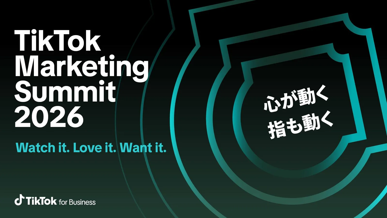
We took five directions to the client, and they confirmed 心が動くと、指も動く。 (when your heart moves, your finger moves). On the English side, "Heart to Act" beat "Heart to Cart", because cart is the commerce trap.
Then the real problem showed up. The character 指, finger, reads as scrolling. The work had to make a finger mean book, buy, save and download on sight.
03 · Copy
Written in Japanese, then checked against the English
The rule was no translation. Japanese lines get written by the logic of Japanese and checked against the English intent afterward, never the other way around. Every line went through a Japanese copy review: structure, rhythm, endings, and whether a competitor could carry it away. The review killed literal translations of the brand's fire and spark imagery along the way.
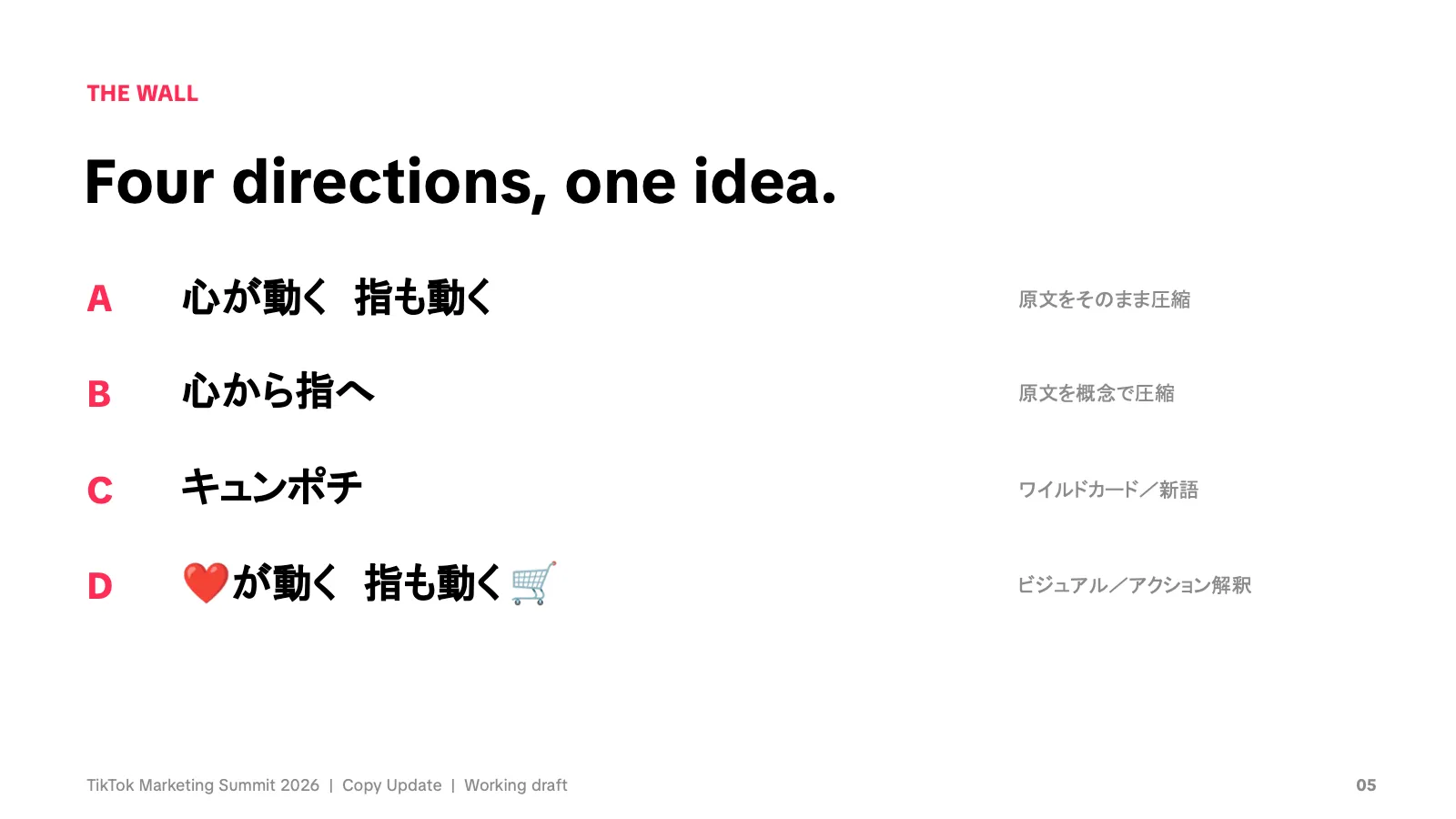
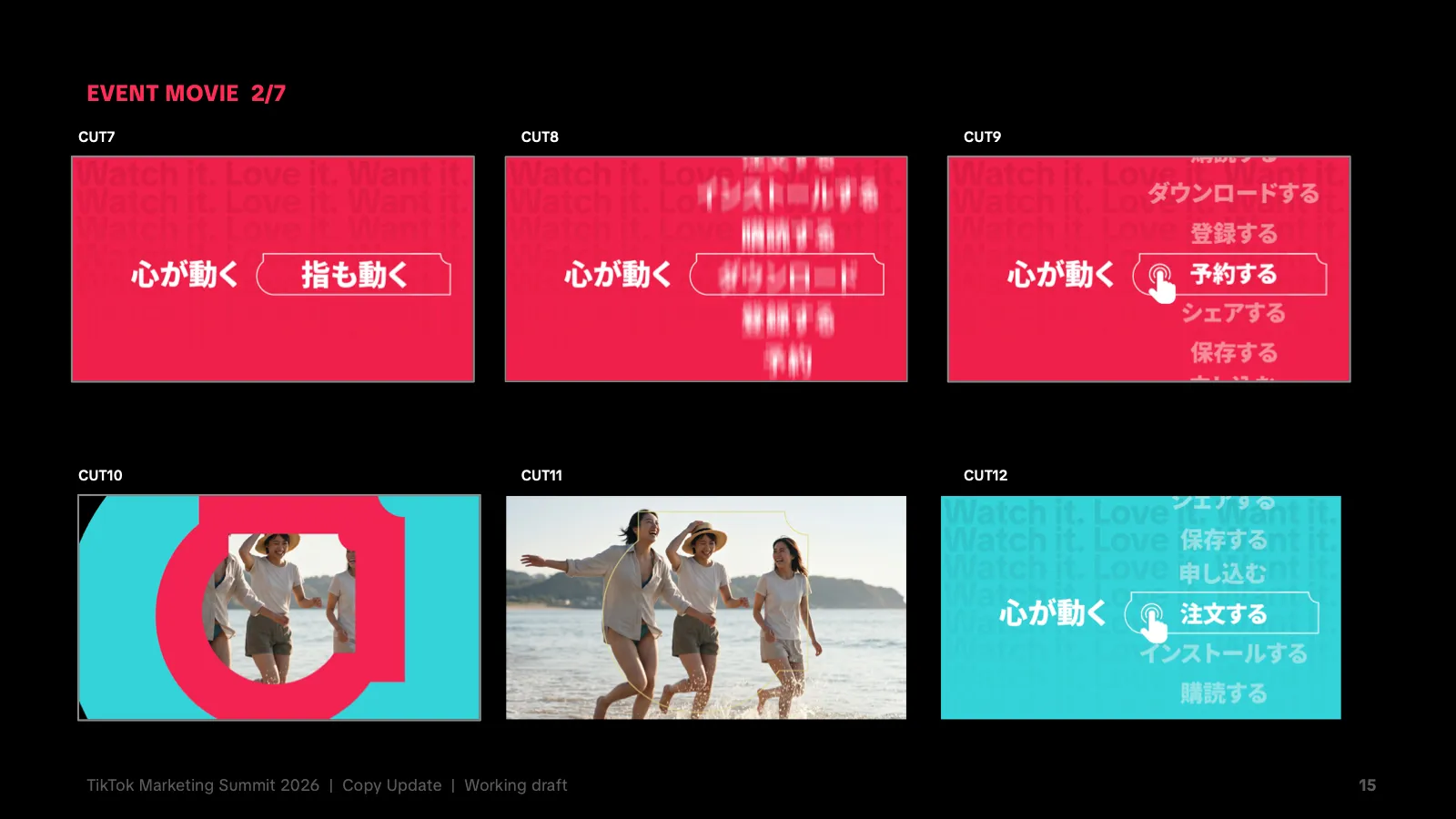
Round two brought homework from the client: shorter and catchier, with the pull of TikTok売れ (selling out because of TikTok). Length was never the real problem. Four rules held the rewrite together: keep the approved 心 (heart) and 指 (finger), shorten only by compressing, by rhythm or down to the concept, let motion and icons explain what words can't, and always show the result right after 指も動く. Four directions went on the wall. The line that launched stays closest to the original.
- 心が動く 指も動く(heart moves, finger moves): the launched line. The comma becomes a full-width space, a breath, the way Japanese posters have long handled it.
- 「見た」の先を、動かす。(move what comes after "watched"): killed. It matches a known weak pattern, an abstract noun plus "beyond" with a company acting on it.
- ときめきは、決済より速い。(excitement is faster than checkout): defended. The only line that could start an argument in the room, which is what a summit stage wants.
04 · Design
The type is the stage
The design rule was that it happens inside the type. A person stands in front of one stroke and behind another, or lives inside a giant glyph. The type works as the environment the subject stands in. In one route a giant 見 (see) is the stage, and the same character appears in the copy line.
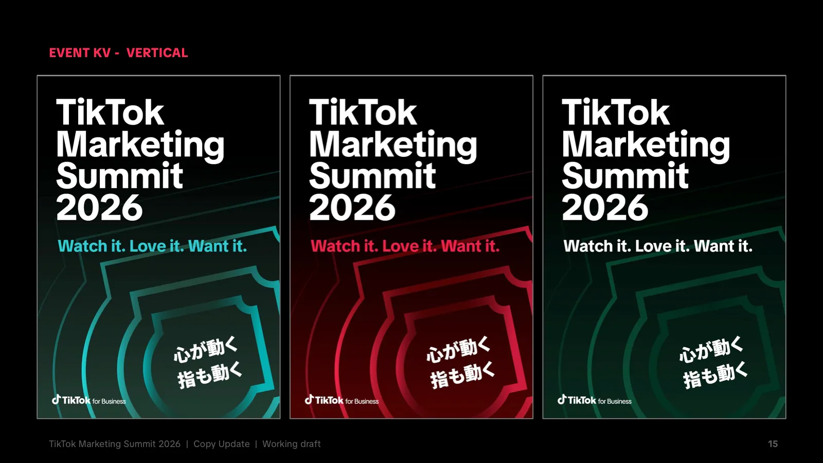
A few rules kept it recognizably TikTok. One field color per key visual from the official palette. Only the official Spark shape. Noto Sans JP Black with TikTok Sans. The interleave happens once per layout, and type never covers a face.
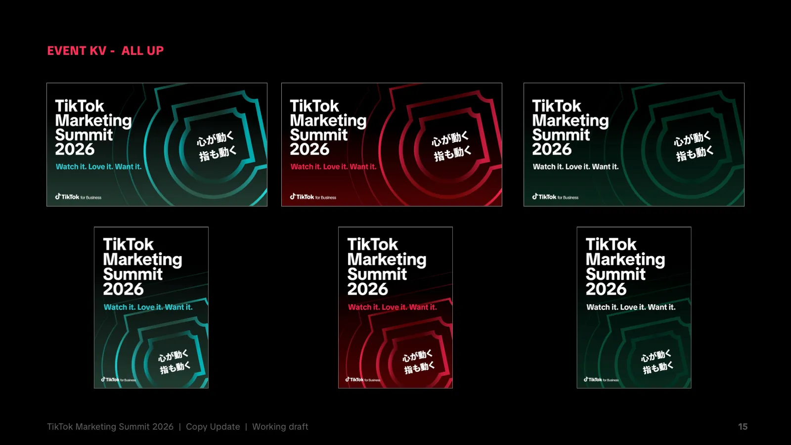
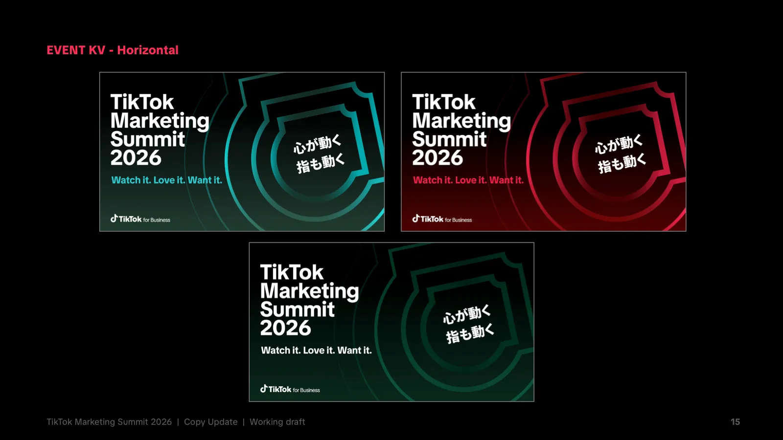
The event key visual ran in three colors across every surface, up to an LED wall 9.6 meters wide.
05 · Film
An opening film built in After Effects
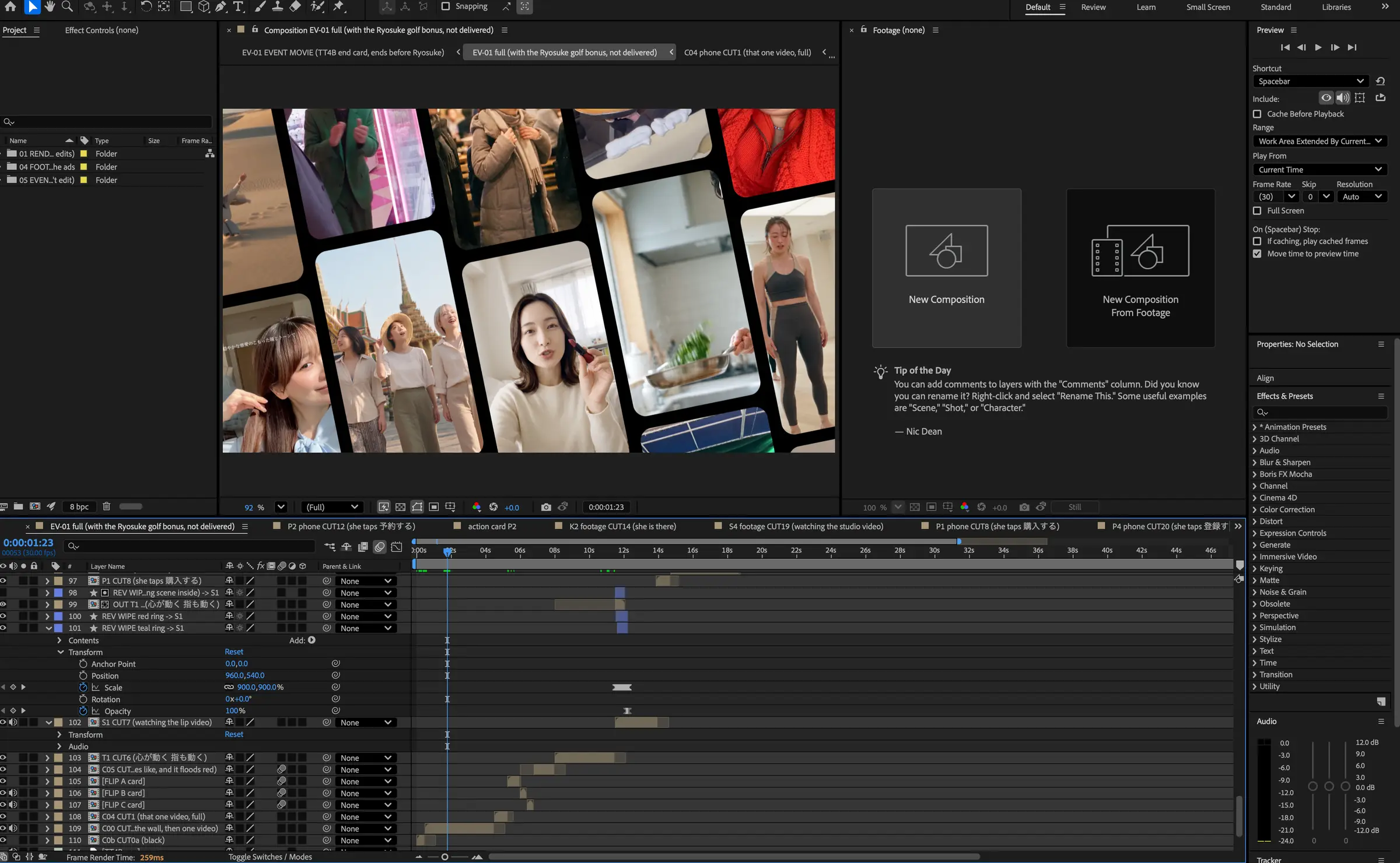
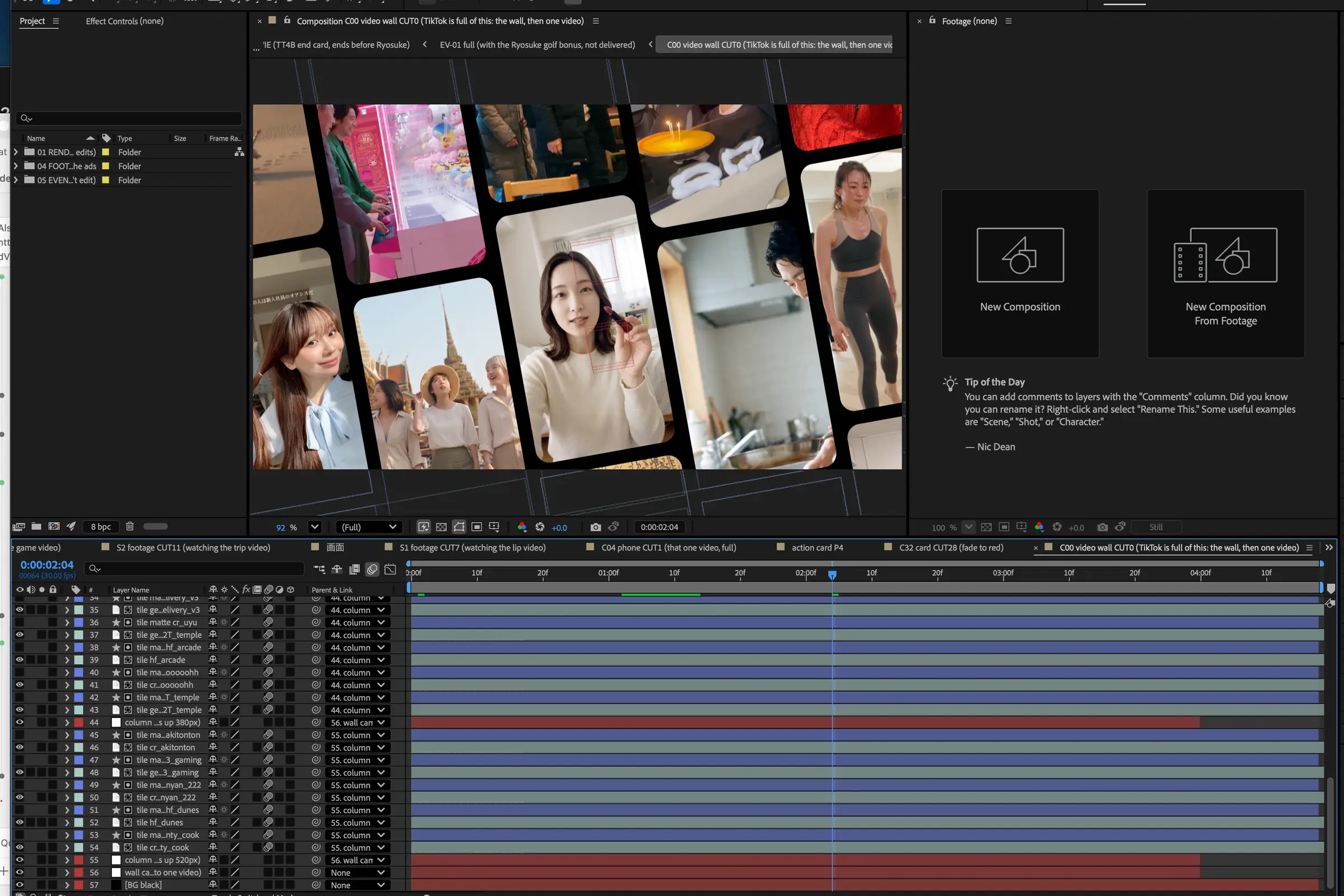
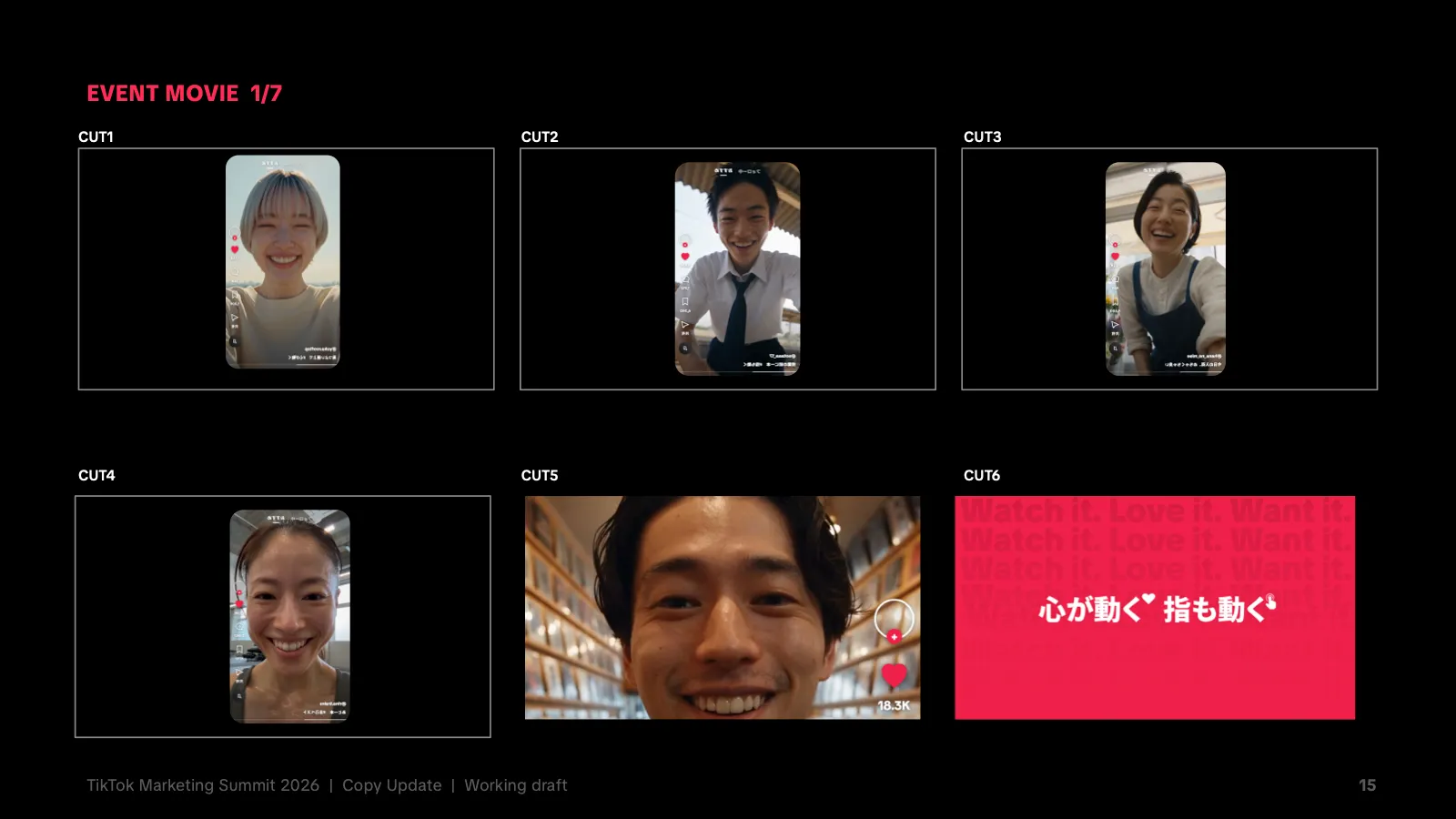
The film opened the summit and runs about a minute, in 16:9 at 1080p. Its job was to make the middle of the funnel visible, the stretch between watching something and wanting it. A still key visual can state that claim but can't show it. It was boarded cut by cut before anything was built.
A nested rounded square, taken from the phone, works as both frame and transition, so the film, the key visual and the venue read as one thing. The project is scripted in After Effects, then my hand edit becomes the source of truth and every later change goes in as a small patch. After approval the client locked structure and flow, so only swaps, timing and text could change.
06 · Method
Same face, start to finish
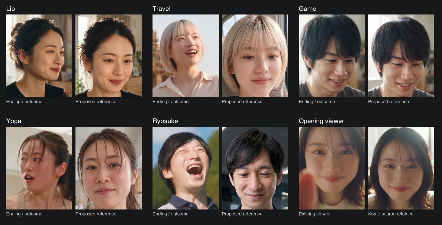
The film's people are AI-generated, so continuity was the real work. The person who taps the screen early on has to be the same person who reacts at the end. Each face got one approved still reference, matched against its ending shot, before any motion was made.
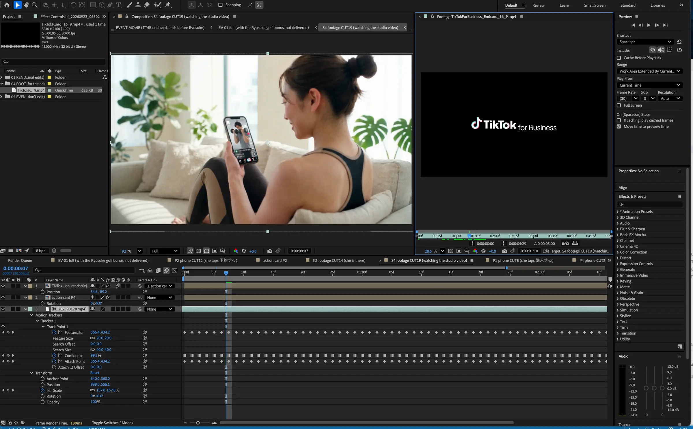
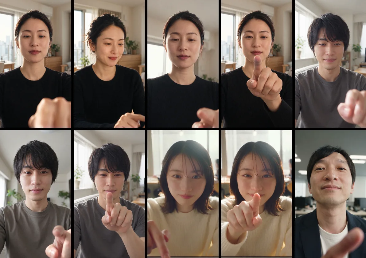
Then the taps. Each is a four-second Seedance clip started from that reference, with the person's own finger reaching for the glass. Many takes failed on the gesture: a finger that hovered, curled or lifted without touching. A shot went round several times before one moved like a real hand. The phone screens were then tracked frame by frame, so the feed stays on the glass as the hand moves.
07 · Timeline
From brief to the summit
Dates come from the project record.
- 5 Aug 2026BriefThe client call sets the problem: make a global tagline work in Japanese and show TikTok as a full-funnel platform.
- 20 Aug 2026Direction chosenThe client picks 心が動くと、指も動く。 and widens the job from copy to a key visual and an opening film.
- 1 Sep 2026Round 2 creative deckShorter, catchier copy, the key visual system and boards for the event film.
- 11 Sep 2026Film storyboardThe After Effects build of the opening film starts from this storyboard.
- 19 to 21 Sep 2026Feedback and tap shotsThe 19 September feedback lets the film grow longer. By 21 September the tap shots are redone so each finger moves naturally, and the phone screens are tracked frame by frame.
- 29 Sep 2026EventTikTok Marketing Summit 2026 in Tokyo. The film opens the summit.